
When trying to present facts and figures to your audience, how can you best convey the information in a memorable fashion? “Through visual presentation,” you might say. Still, this is a very broad area, and it stretches the imagination to devise ways to combine diverse bits of information.
It’s a struggle shared by the top practitioners of journalism. On March 4, 2021, two data journalists and an editor from The Economist gave a one-hour behind-the-scenes webinar to discuss the work they do.
The Economist was once very skeptical of the need for a data journalism department. Due to the subject matter (economics—supply—demand), their pages always contained data, but these were typically small, unappetizing graphs. (See example below.) “These were not elegant and were sometimes hard to read,” said Alex Selby-Boothroyd, head of data journalism at The Economist.

Now they have a dedicated team to put together maps with colour coding. He cited the example of a coloured graph that showed changes in air pollution over Poland, Russia, and Italy, a merging of geographic and scientific information that was once impossible to do in the fast turnaround time of a weekly magazine.
Selby-Boothroyd described the inception of a piece of data journalism. “A journalist may have an idea in mind,” he said. They start with a vague impression that, for example, “choruses in songs appear much earlier than they used to.” They might hypothesize that this is due to Spotify playing only the first 15 seconds for free before the user must pay for a download.
The journalist came up with a plan of attack: listen to all the hit songs in, say, the past 20 years, and ask: “in a given year, how many of the top 10 hits play a chorus within the first 15 seconds?” Then comes the legwork, or more properly, the earwork.

“Reporting on the current pandemic is all about data,” said Sacha Nauta, public policy editor at The Economist. “Getting data, combining data, and presenting it in new ways.”
Selby-Boothroyd gave a shoutout to Johns Hopkins Hospital, whose epidemiologists “maintained a dashboard and made all CSV files available.” CSV refers to a common data format: comma-separated values. “Our people scraped it for data every night,” looking for patterns.
Economists love early detection of trends. He gave an example of “data building the story.” A little over a year ago, before any Western nations went into Covid-related lockdown, a data journalist noticed that, every time he looked up an address on Google maps, it showed a “busy-ness indicator.” He thought it would be interesting to keep an eye on this while the pandemic began to spread. He set up a script to strip data in 13 major cities to see the effects of lockdown measures. Soon after the story appeared, “Google made that dataset, Mobility, available to everyone.”
Over the years, data journalists learned what not to do, said Nauta. [Note: click here to see some examples. The Economist is very open about opportunities for improvement.]
“Pie charts, 3D, and radial charts all distort the data,” said Rosamund Pearce, visual data journalist at The Economist. “When you break the axis scale, so it does not start at zero, that also distorts.” Adding cartoon figures or even neutral-looking icons can distract the viewer.
“The must-haves,” Pearce said, “are labels that say where the data is from, when, and what units.”
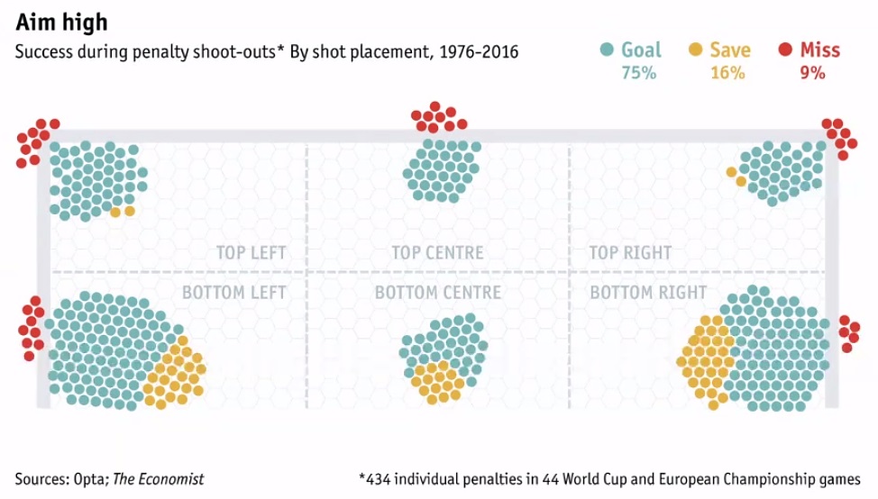
There can be several iterations before the team settles on a way to present data succinctly and clearly. “Occasionally you choose something right immediately.” Sometimes the axes are replaced by something completely different, such as this soccer goal placement graph which redraws the goalpost area to illustrate a point about successful soccer kicks.
It’s important to counteract bias. The data and the hypothesis receive a lot of scrutiny, Selby-Boothroyd said. “If it’s too good to be true…” Big universities with well-funded data research groups tend to have high-quality data and are often willing to share. “As with classic reporting, we always try to find a corroborating source.”
Nauta commended the data journalism team for creating a significant image. In the early days of the pandemic, they took the Centers for Disease Control (CDC) data and created a graphic to visualize what was meant by the odd phrase: flattening the curve.
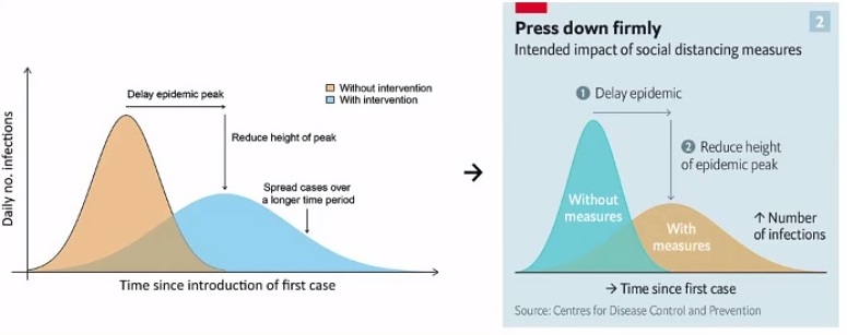
“Crucially, another researcher took our graphic and added the line to show healthcare system capacity,” Pearce said. The following chart became a central image in helping the public understand why lockdown measures had to be enacted.

For those of the audience interested in a career in data journalism, Pearce said that the Economist’s staff comes from a variety of backgrounds. She comes from science journalism; Selby-Boothroyd said his university degree is in languages. ♠️
The 1918 influenza graphic is from The Guardian.
All other visuals, except for the stickman drawing, are from The Economist.